Project 2: Simple Jewelry
Research & Ideation
For the second project we were divided into groups of three to four people. My group consisted of Julika, Lisa and me. We were tasked with finding a stakeholder for whom we should design an online presence. We found an entrepeneur in our social circle. The stakeholder had been working with jewelry for the past two years in flea markets and art markets. He wanted to expand into the digital market in addition to his already existing sales.
Stakeholder Interview
Our stakeholder planned to open an online dropshipping business for jewelry. He wanted a solution that works both on mobile and on desktop. He realized that there is a need for jewelry with minimal design. The online shop that he planned to open should accomodate and fit to products with simple designs. They would be easy to the eye and comfortable, something that one could wear to the gym. The pricing would be in the low to mid range; he also planned to implement a charity that fed out of a portion of every purchase.
User Interviews
For user research we interviewed people who bought jewelry online before for themselves or as a gift. The interviewees were people from our social circles or from the bootcamp. In total we interviewed five people. They were moderate to intensive online shoppers for different items including jewelry and clothing. Almost all of them have had bad experiences buying a product online from a website where the product was not as advertised. We concluded that the most important aspect should be to create a website that is trustworthy. They emphazised a modern design, trust labels, reviews and different payment options to show reputability. For buying jewelry it is especially important to list the material, have multiple good quality pictures and show over all that the website is safe.
We clustered the interview findings in an affinity diagram which we divided into the following categories: For whom do they buy jewelry, Shopping behaviour, what they value in online shopping, which jewelry and where?, how much they spend on jewelry in one purchase.
Problem Statement

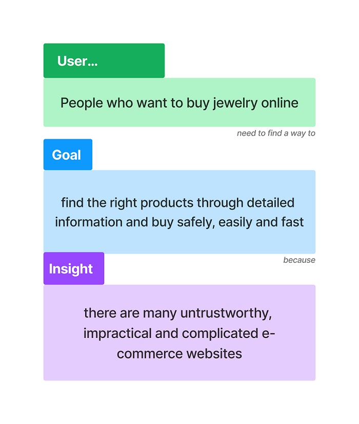
Then we thought up a problem statement for the project. “People who want to buy jewelry online need to find a way to find the right products through detailed information and buy safely, easily and fast because there are many untrustworthy, impractical and complicated e-commerce websites out there.”

We conducted a competitor analysis and created a SWOT diagram.
Persona & User Journey Map

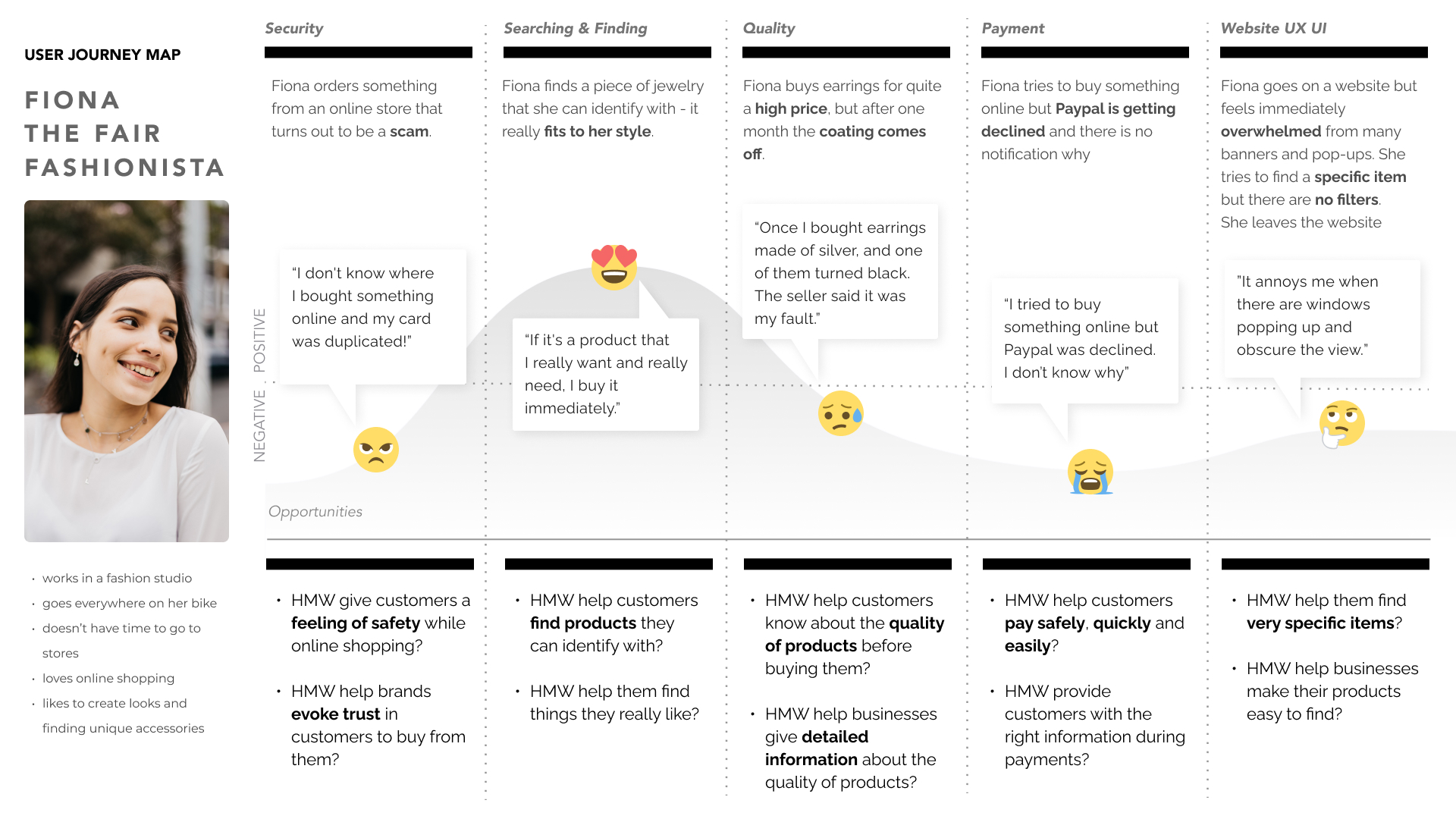
For the Persona and User Journey Map we created Fiona Fox, a fashionista who is looking to complement her own outfits in an affordable manner with simplistic jewelry.

In the User Journey Map we detailed Fiona’s experience shopping online for jewelry. We showcased problems with payment security, reliability of the payment process, quality of the product, overwhelming user interface.
During the ideation process we employed the MoSCoW Method and decided which features to include in the website. We decided to focus on categories, filters, product pages, a menu and a charity, which was originally an idea of the stakeholder.
Moodboard
![moodboard]()
We created a moodboard and conducted a survey to compare brand attributes. The response we got was positive. The brand attributes we were aiming for mostly aligned with the findings.
Sitemap & User Flow
![userflow]()
Before we began with wireframing we constructed a Sitemap and User Flow in which a customer makes a purchase.
Lo-Fi to Hi-Fi
From low-fidelity to high fidelity a lot of thought went into how to display categories, search bar, filtering options, ratings, reviews, basket and pricing. Throughout the whole process we asked other students to share their opinions on our iterations and incorporated their feedback accordingly.
Colour Palettes & Typeface


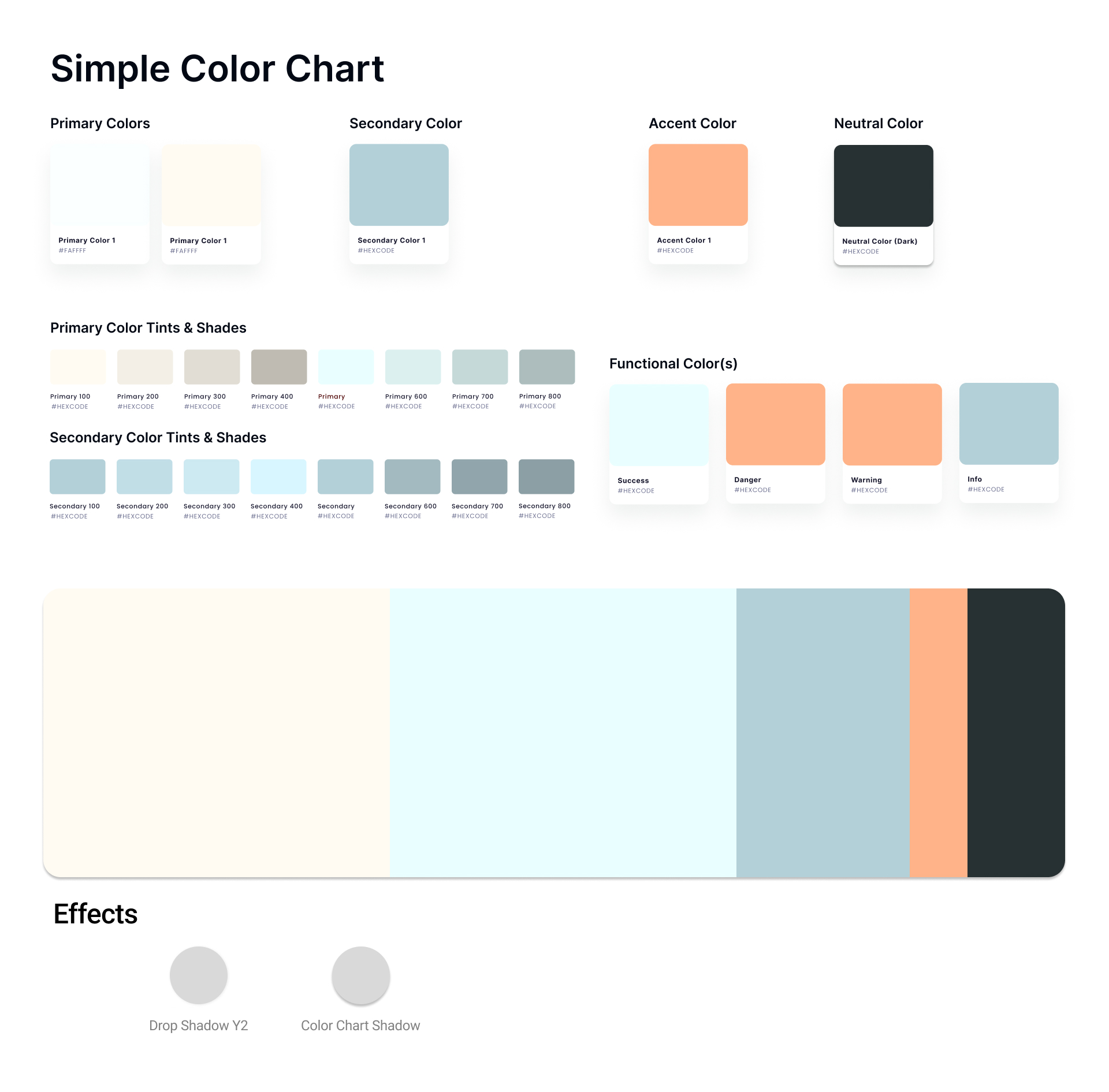
With the help of our moodboard we chose multiple colour palettes to convey our brand attributes. We decided for a light blue for its tranquility and salmon for its friendly and approachable associations. As typeface we decided to use mostly Futura and Lato in the body for their simplicity and legibility. In the critique for our high fidelity design we got positive feedback by other students, who agreed with our choices.
Responsive Design
After completion of high fidelity prototyping we implemented responsive design for desktop, tablet and mobile to allow users from different devices to access our website.
Further Features
Due to time limitations we didn’t implement features such as a material guide, social media integration and language options. Finally we presented the project to the course including all the steps and thought processes we went through.

